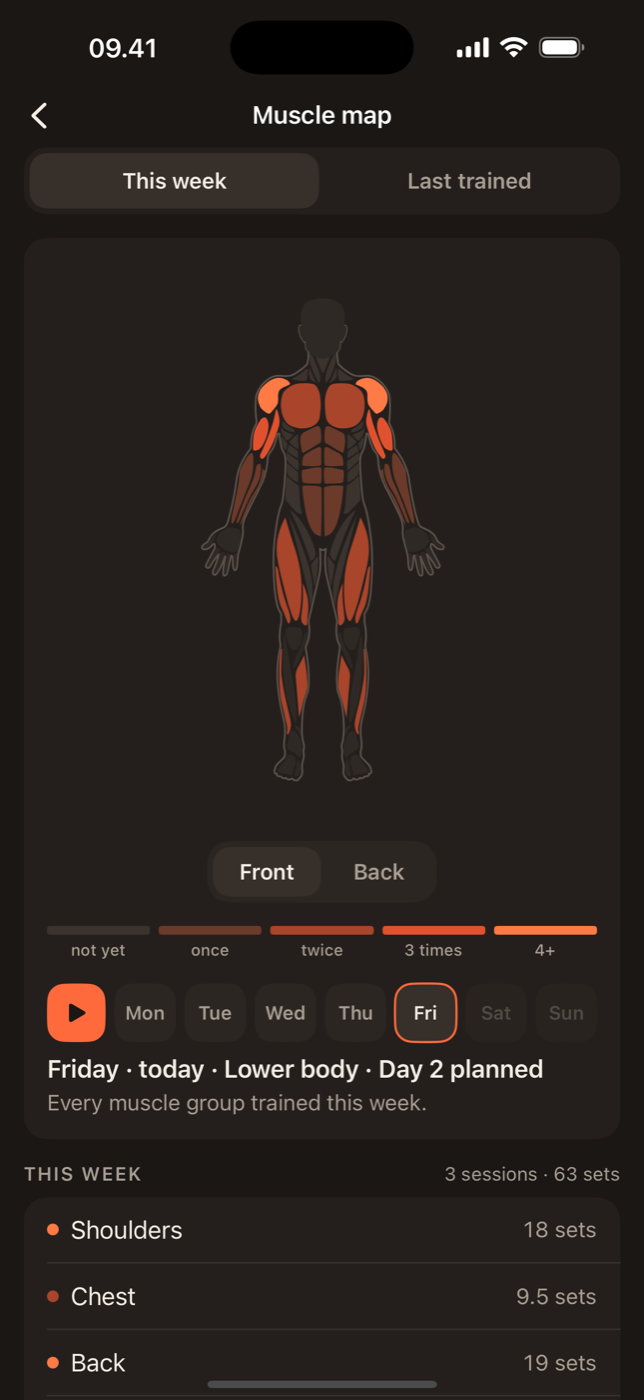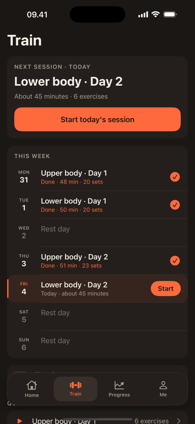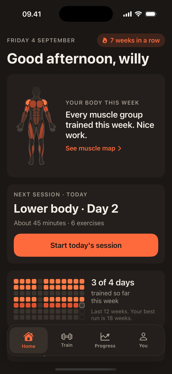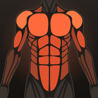
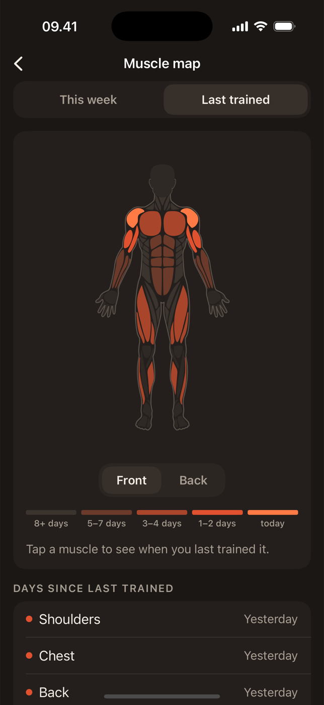
A muscle map is a picture of your training week drawn on a body. Each muscle is coloured by how much work it did, so instead of scrolling through sessions you look at one image and see what you trained and what you missed. This guide explains how the map in Lift is built and what to do with what it shows.
What the colour means
In the default view, colour is effective sets this week. Grey means no sets. The warmer the colour, the more sets, up to bright orange at twelve or more. Twelve is where most weekly-volume research starts to see reliable growth, so a bright muscle has had a proper week. Read more in how many sets per muscle per week.
The week resets on Monday. Rest days do not change the colours; they only stop them rising. So a map that looks the same on Wednesday as it did on Tuesday is a rest day, not a problem.
How a set is shared
Most exercises work several muscles, and the map has to decide how to share the credit. Lift uses a simple rule: a set counts as one set for the primary muscle and half a set for each helper.
- Three sets of bench press: 3 for chest, 1.5 for front shoulders, 1.5 for triceps.
- Three sets of barbell rows: 3 for upper back, 1.5 for biceps, 1.5 for rear shoulders.
- Three sets of squats: 3 for quads, 1.5 for glutes, 1.5 for adductors.
This is why arms often look warmer than you expect after a week with no curls: every press and row has been feeding them. It is also why hamstrings often look cold after a leg day built on squats and leg press. Neither of those movements gives hamstrings much, so they need their own exercise to show up.
Every one of the 876 exercises in Lift has its primary and helper muscles set. Custom exercises use whatever muscles you give them.
Front and back
The map shows the front and back of the body at the same scale, side by side. Read them together. Most people can list what they did to the front; the back view is where the gaps are.
A healthy week looks roughly balanced: chest and upper back at similar warmth, quads and hamstrings both showing colour, front and rear shoulders not wildly apart. A front that glows over a grey back is the most common pattern and the one most worth fixing, because it is how shoulders start to hurt.
The last-trained view
Switch the map to last trained and colour means time instead of volume: bright for muscles trained today, fading to grey over two weeks. This is the view for the unplanned session. Walk into the gym with no plan, open the map, and train whatever is coldest. It is also the quickest way to spot a muscle that has quietly dropped off the plan; if calves have been grey for three weeks, that is the answer.
Three patterns to act on
One bright muscle, its partner grey. Chest bright and upper back grey, or quads bright and hamstrings grey. Add the partner's exercise to the next session, usually a row or a hinge, and drop one set from the bright side.
Everything pale on Sunday. Fewer sets than you thought. Either sessions are being cut short or too many sets are stopping well short of hard. Count the sets in your log; if the number is fine, the effort probably is not.
Everything bright, weights not moving. Volume is high but progress has stalled for three weeks or more. This is where more is not the answer. Cut sets by a quarter for two weeks and let the weights recover.
What the map is not
It is not a recovery model, a soreness predictor or a coach. It counts sets and colours muscles. That simplicity is the point: you can check it in the time it takes to unlock your phone, and everything it shows is something you did. Lift Pro keeps every week's map, so you can scroll back through a training block and watch the balance change. The current week is free.
Try it
Log one session in Lift and look at the map. Then log the rest of the week and look again. The picture of your training that forms is usually different from the one in your head, and that gap is where the next month of progress comes from. The muscle map feature page shows the map in more detail.